
A few days ago my twitter became red amid the stock and crypto market meltdown. During a flood of memes and catastrophic news about the recession, there was a red bricked wall showing how much the stocks stumbled that day. I couldn’t find that exact image again, but as I recall it looked something like this.
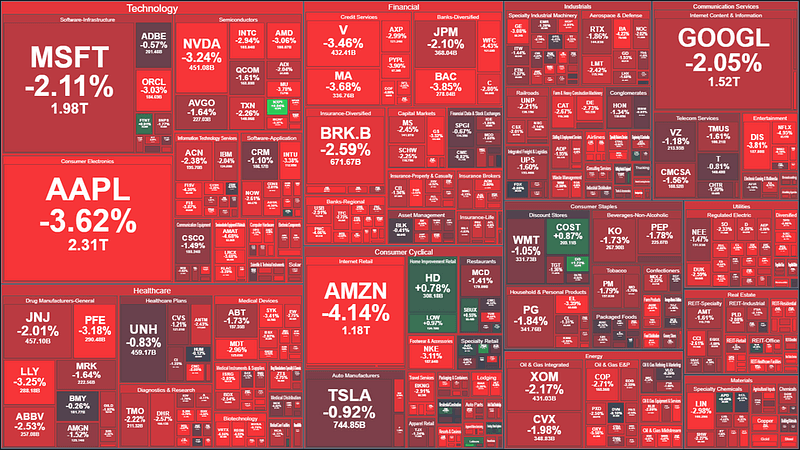
This picture condenses the Wall Street’s suffering in 960 pixels by 540 is known as a treemap chart. It frequently stamps the news on tv, sometimes with happier colors, but usually in a similar shape.
This chart is quite powerful since it is capable of summarizing and presenting data from many different angles at the same time. Take Microsoft (MSFT) as an example, and let’s see all the information we can extract using this chart.
We can see that Microsoft belongs to the industry of Software-Infrastructure which is belongs to the Technology sector. Its size in the chart is based on its market cap, which you can also find two lines under its symbol (MSFT). The -2.11% represents how much the stock price dropped on that day. Around $40Bn 😬
Now that we understand how the treemap chart works, and how it represents the data, let’s create ours using Python!
Dataset
The source data for this example is the Kaggle dataset S&P 500 Stocks (daily updated). You can download it from here.
If you want to skip the preprocessing part of the tutorial, you can find the preprocessed dataset here. Then you can use this shortened version of the notebook to generate the chart.
The source dataset has three files, but we will use only two for this tutorial sp500_companies.csv which contains data about each company such as sector, industry, and market cap; and sp500_stocks.csv which has the stock’s daily movements.
Preprocessing
For the preprocessing, we will first load the dataset sp500_companies.csv and select a few columns.
Now we find the days that the stocks performed the worst.
To find the worst performing days we group the records by Date, subtract the column Close by the Open and store the result of this calculation in the Net column. We then sort the dataframe based on the Net column, so the worst days come first.
Based on our metric, we can see that the worst day was 2020–03–20 at the beginning of the pandemic, and the second worst day was March 7th, 2022. Probably around when I saw the chart on my twitter. Let’s use the first date to create our chart.
Enriching the dataset
To enrich our dataset, we are going to use the file sp500_companies.csv. The columns we will select from the company’s dataset are Shortname, Sector, and Weight (how much impact the company has on the S&P500 list). We also pick the Symbol column, which we use when merging the two data frames.
In the last step of the preprocessing, we create a new column called PcChangeDay. This column stores the percentual change between the Opening and Closing stock price during that day.
Let’s save this dataframe, so anyone can run the code to generate the chart without having to download the source datasets and run the preprocessing steps 😉
Creating the treemap chart
We will use the Python module Plotly to create the treemap chart. You can find the chart’s documentation on this page.
For the first try, let’s limit the number of custom parameters we use to see what the chart looks like by default.
Ah… you can also hover and click the cells to see more information 😉
The method px.treemap() above has five main parameters. The dataframe for the input dataframe; path describes the hierarchy of the data; values defines how big the stock area is in the chart. We use the weight column here, so companies with more impact on S&P500 appear larger; color the column used to vary the stock’s color; color_continuous_scale sets the colormap. In this case, red, dark red, and green.
Now let’s make this plot visually better by tweaking a few parameters.
For me, the plot looks a lot nicer. The text is centered and aligned, it shows the daily variation as a percentage, and we got rid of the color scale.
You can more information about those custom configurations here and here.
Takeaways
In this tutorial, we learned how to create a treemap chart and visualize the worst day for the S&P 500. We also learned that the chart produced by Plotly is interactive, and by clicking on the different regions, we can drill up and down.
See you in the next post! 👋